Learning Objectives
Visualize RGB images from remotely sensed data
Visualize true-color and false-color composites
View path and row of swaths
Plot Remote Sensed Images#
Import required modules and data.
import os

# Import GeoWombat
import geowombat as gw

# import plotting
from pathlib import Path
import matplotlib.pyplot as plt
import matplotlib.patheffects as pe
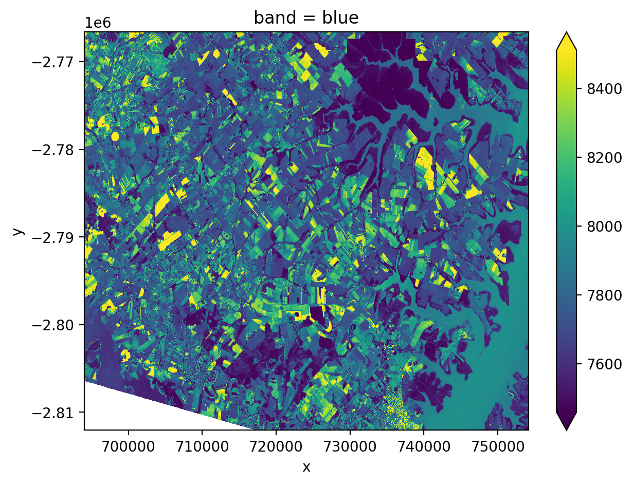
Plot a Single Band Image#
from geowombat.data import l8_224077_20200518_B2

fig, ax = plt.subplots(dpi=200)

with gw.open(l8_224077_20200518_B2,
                band_names=['blue']) as src:
    src.where(src != 0).sel(band='blue').plot.imshow(robust=True, ax=ax)
plt.tight_layout(pad=1)
Plot a True Color LandSat Image#
Here we open the image, missing data is removed with .where(src != 0), remember the bands in this file are stored in reverse order (blue, green, red), so we put them back into order .sel(band=[3, 2, 1]).
# load example data
from geowombat.data import l8_224078_20200518

fig, ax = plt.subplots(dpi=200)
with gw.open(l8_224078_20200518) as src:
    src.where(src != 0).sel(band=[3, 2, 1]).plot.imshow(robust=True, ax=ax)
plt.tight_layout(pad=1)
Note you can also set the missing data value when opening a file (assuming it is not in the raster profile), those values then need to be masked using gw.mask_nodata() and src updated:
# load example data

fig, ax = plt.subplots(dpi=200)
with gw.open(l8_224078_20200518, nodata=0) as src:
    # replace 0 with nan
    src = src.gw.mask_nodata()
    src.sel(band=[3, 2, 1]).plot.imshow(robust=True, ax=ax)
plt.tight_layout(pad=1)
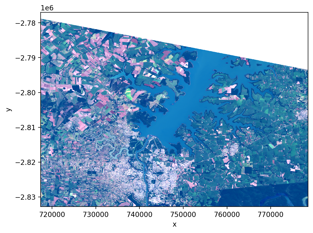
Plot False Color Composites#
We can use the red, green, and blue channels to show different parts of the spectrum. This allows us for instance to “see” near-infrared (nir). Moreover certain combinations of bands allow us to better identify vegetation, urban environments, water, etc. There are many false colored composites that can be used to highlight different features.
Color Infrared (vegetation)#
Here we will look at a common false color combo to assigns the nir band to the color red. This make vegetation appear bright red.
from geowombat.data import rgbn

fig, ax = plt.subplots(dpi=200)

with gw.open(rgbn,
            band_names=['red','green','blue','nir'],) as src:
    src.where(src != 0).sel(band=['nir','red', 'green']).plot.imshow(robust=True, ax=ax)
plt.tight_layout(pad=1)
plt.savefig("rgb_plot.png", dpi=150)
Common Band Combinations for Landsat 8#
Name |
Band Combination |
|---|---|
Natural Color |
4 3 2 |
False Color (urban) |
7 6 4 |
Color Infrared (vegetation) |
5 4 3 |
Agriculture |
6 5 2 |
Atmospheric Penetration |
7 6 5 |
Healthy Vegetation |
5 6 2 |
Land/Water |
5 6 4 |
Natural With Atmospheric Removal |
7 5 3 |
Shortwave Infrared |
7 5 4 |
Vegetation Analysis |
6 5 4 |
Plot LandSat Tile Footprints#
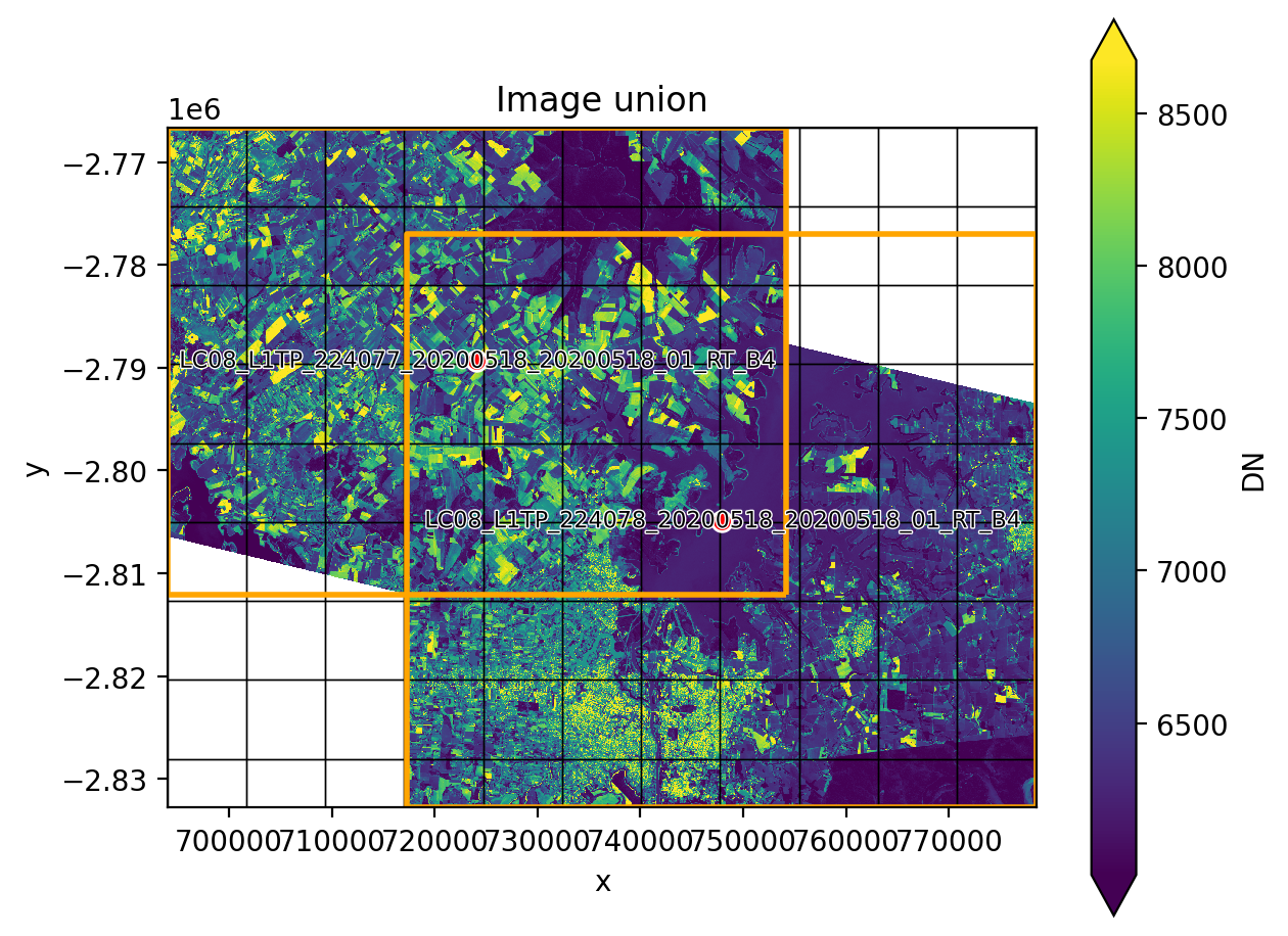
Here we set up a more complicated plotting function for near IR ‘nir’. Note the use of footprint_grid.
from geowombat.data import l8_224077_20200518_B4, l8_224078_20200518_B4
from os.path  import basename
def plot(bounds_by, ref_image=None, cmap='viridis'):
    fig, ax = plt.subplots(dpi=200)
    with gw.config.update(ref_image=ref_image):
        with gw.open([l8_224077_20200518_B4, l8_224078_20200518_B4],
                        band_names=['nir'],
                        chunks=256,
                        mosaic=True,
                        bounds_by=bounds_by,
                        persist_filenames=True) as srca:
            # Plot the NIR band
            srca.where(srca != 0).sel(band='nir').plot.imshow(robust=True, cbar_kwargs={'label': 'DN'}, ax=ax)
            # Plot the image chunks
            srca.gw.chunk_grid.plot(color='none', edgecolor='k', ls='-', lw=0.5, ax=ax)
            # Plot the image footprints
            srca.gw.footprint_grid.plot(color='none', edgecolor='orange', lw=2, ax=ax)
            # Label the image footprints
            for row in srca.gw.footprint_grid.itertuples(index=False):
                ax.scatter(row.geometry.centroid.x, row.geometry.centroid.y,
                            s=50, color='red', edgecolor='white', lw=1)
                ax.annotate(basename(row.footprint).replace('.TIF', ''),
                            (row.geometry.centroid.x, row.geometry.centroid.y),
                            color='black',
                            size=8,
                            ha='center',
                            va='center',
                            path_effects=[pe.withStroke(linewidth=1, foreground='white')])
            # Set the display bounds
            ax.set_ylim(srca.gw.footprint_grid.total_bounds[1]-10, srca.gw.footprint_grid.total_bounds[3]+10)
            ax.set_xlim(srca.gw.footprint_grid.total_bounds[0]-10, srca.gw.footprint_grid.total_bounds[2]+10)
    title = f'Image {bounds_by}' if bounds_by else str(Path(ref_image).name.split('.')[0]) + ' as reference'
    size = 12 if bounds_by else 8
    ax.set_title(title, size=size)
    plt.tight_layout(pad=1)
The two plots below illustrate how two images can be mosaicked. The orange grids highlight the image footprints while the black grids illustrate the DataArray chunks.
plot('union')